Chyron Announces the New AXIS Maps
The new edition of Chyron’s cloud-based map graphics platform will be available at the end of Q4 2025.
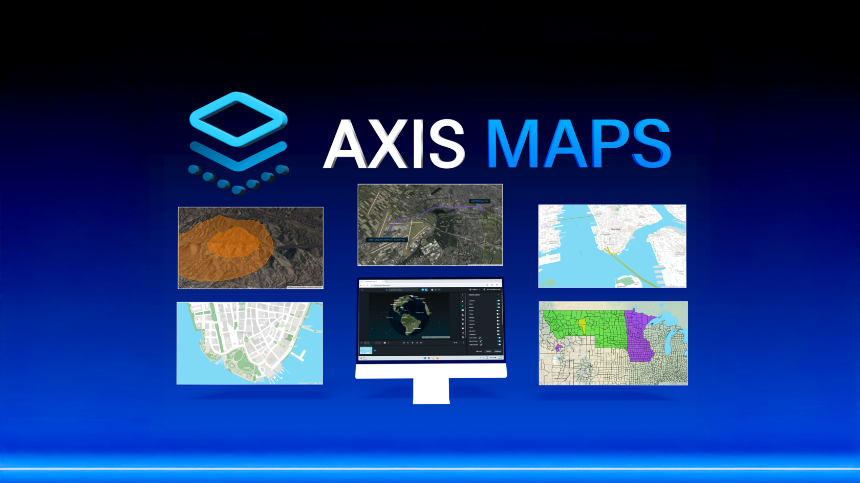
MELVILLE, N.Y. – October 1, 2025 – After an early showing at IBC 2025, Chyron is officially announcing a brand-new edition of AXIS Maps, a maps graphics creation module for live news storytelling. This next generation of AXIS Maps revolutionizes the map creation workflow for broadcasters with high-quality 3D map visuals, extensive data visualization, intuitive illustration tools, and a simplified interface to go from design to on-air playout with ease.
AXIS Maps is part of Chyron’s greater AXIS ecosystem, a cloud-based, hosted platform that offers the full range of graphics order management and creation tools that broadcasters need to fulfill professional-grade visuals for every story in a fast-paced news environment – all within a web browser interface. With AXIS, everyone from reporters, to editors, to news producers can quickly locate and create rich graphic scenes with images, maps, and charts to bring stories and data to life.
“This evolution of AXIS Maps is the result of a true partnership with our customers from all around the globe,” said Peter Matis, product manager of AXIS. “Their feedback was the blueprint for everything we developed – 3D map visuals, new built-in data layers, interface enhancements, and so much more – it’s an honor to deliver a solution that directly reflects their needs and helps news professionals tell more powerful stories, more efficiently”.
The new AXIS Maps is built to provide broadcasters with the tools they need to captivate modern audiences with cutting-edge map visuals. Offering rich 3D maps that integrate true-to-life building and elevation model data, broadcasters can immerse viewers with lifelike map scenes with dynamic keyframe animations. Alongside these new visuals, AXIS maps adds support for an array of new data layers – such as bridges, tunnels, parks, and airports – as well as the ability to import custom data for specific analysis, providing more flexibility for broadcasters to tell data-driven stories. Additionally, AXIS Maps features new graphics tools to highlight areas of interest – be it 3D polygons on map terrain, custom routes, or border coloration at national, regional, district, city, or local levels.
To ensure all members of an international news team can make the most of AXIS Maps’ powerful graphics features, ease-of-use has been a central focus for the development team. For any user, regardless of skillset, AXIS Maps makes it easy to locate an area-of-interest, visualize the necessary data layers, add graphic elements, and create scenes with fluid animations. At an organizational level, AXIS Maps provides tools to maintain show-looks and branding guidelines across productions with global design parameters, as well as tools to address audiences in multiple international markets with map localization tools to designate the language in which location names are displayed.
To learn more about the revitalized AXIS Maps, check out our landing page for more exciting details!