5 Ways to Visualize Weather and Drive Viewership
Weather is a cornerstone of news broadcasting because it is a significant factor in most people’s lives. It affects decisions they make about day-to-day life — what to wear, outdoor activities, travel plans, etc. So, for a news broadcaster, providing informative, educational, and compelling weather content is an important way to get people to tune in and engage with programming. A good weather segment can make a newscast the place to go for information.
While everyone knows what weather is and what a typical forecast entails, the right use of weather graphics — the right information in the right way at the right time — can make a tremendous impact in helping viewers to engage and understand what weather means for them. Let’s look at five ways of visualizing weather that deliver useful information in a meaningful way.
No. 1: The Table-Based Graphic
The simplest form of weather graphic is the table-based graphic, which presents the information viewers need to plan their week around the weather. It is a fixture of the daily newscast and weather report, an expected and familiar part of the news presentation. Typically, this is a three-day outlook or seven-day forecast for the week, and it provides a summary or preview of what’s in store. For each day of the week, the graphic might show an icon indicating sunny, cloudy, rainy, snowy, etc. – as well as the daily high and low temp. It’s a straightforward graphic that provides essential information at a glance. Within seconds, viewers know what their day and week look like, weatherwise.
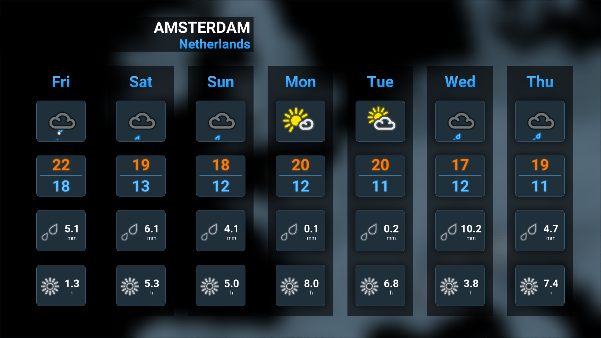
In terms of graphics creation, the table-based graphic is one of the most straightforward. It involves simple integration of data sets with text fields, as well as parameters for the icons that show weather conditions each day.
Who Watches: Nearly everyone, as they plan their daily wardrobe, commute and activities.

No. 2: The Chart-Based Graphic
Driven by more granular data, the chart-based graphic gives viewers the information they need to plan the particulars of their day. Providing more nitty-gritty aspects of the weather forecast, these graphics help people make decisions about when to run an errand, whether to bring rain gear and an umbrella to a kid’s soccer game, or whether today, tomorrow, or the next day will be the better day to go hiking, biking, sailing, and so on.
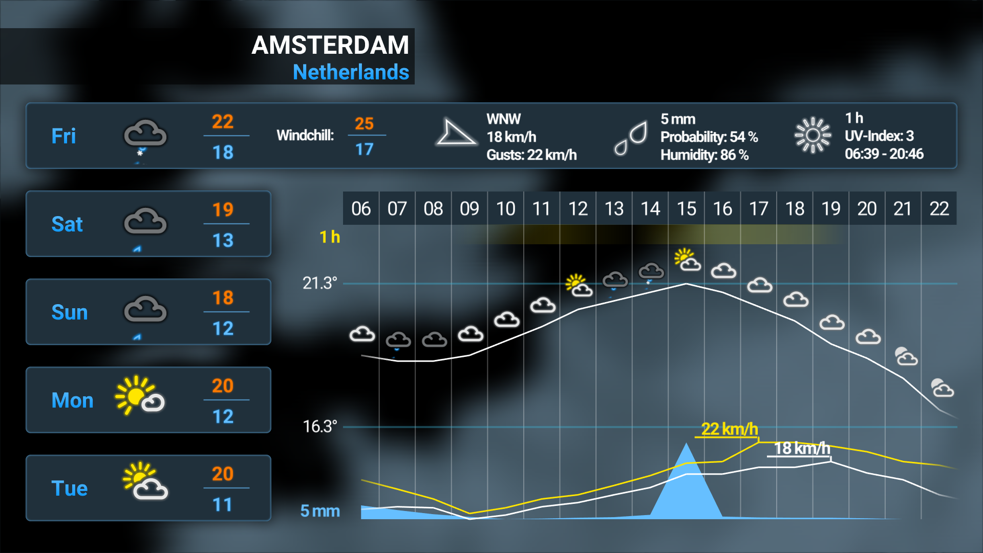
In addition to telling viewers that rain is expected today, the chart-based graphic can show fluctuations in precipitation throughout the day. It can illustrate if and how the wind will pick up with that change in weather — when the elements will be at their worst, and when they will subside. Humidity, dew point, UV index, air quality index, and even pollen counts might be added, depending on the region and factors affecting it. This kind of chart-based graphic lets the weather presenter dive into all the technical aspects of the forecast.
Who Watches: Anyone planning outdoor activities or scheduling flexible errands

No. 3: The Map-Based Graphic
In addition to adding visual interest, map-based graphics give weather presenters a way to provide information about a larger area or region. They can seamlessly move through multiple data points — highs and lows for notable cities, patterns of precipitation across the region, a heat map for a specific area, and so on — to take a broader look at what’s happening and offer valuable information to a wider viewing audience.
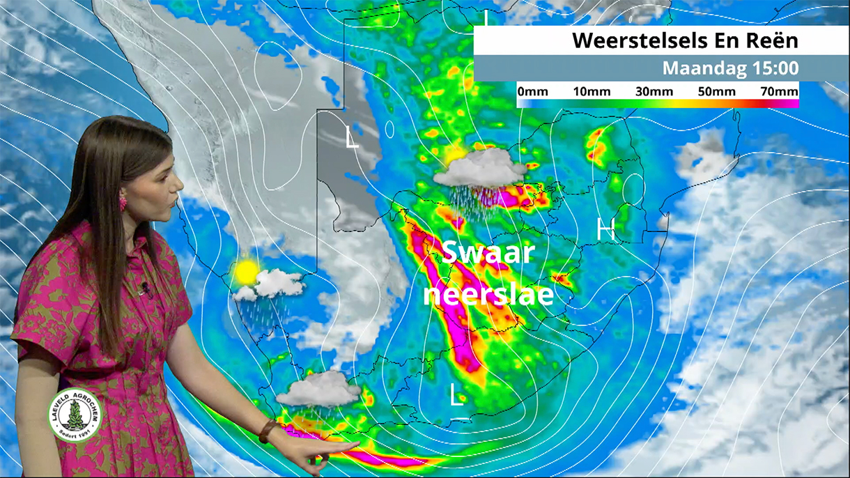
As they focus on different areas, presenters can complement the map with table- and chart-based graphics that offer local detail, such as simple three-day forecasts for key cities. Map-based graphics are easy to templatize, so once the graphic and relevant data sets are set up, the presenter can easily select and move through the most important data points.
Who watches: business and vacation travelers, people with friends and family in other places, climate and weather watchers

No. 4: Global Analysis
Using a 3D sphere representing Earth or an area of it, weather presenters can further increase the scope of their analysis. This is a valuable tool in showing the forces driving weather patterns: where and why something is happening, how it’s developing, and where it’s likely to go. Hurricane coverage, for example, often relies on this type of graphic to show changes over time and predictions about which areas will be hit next, and to what extent.
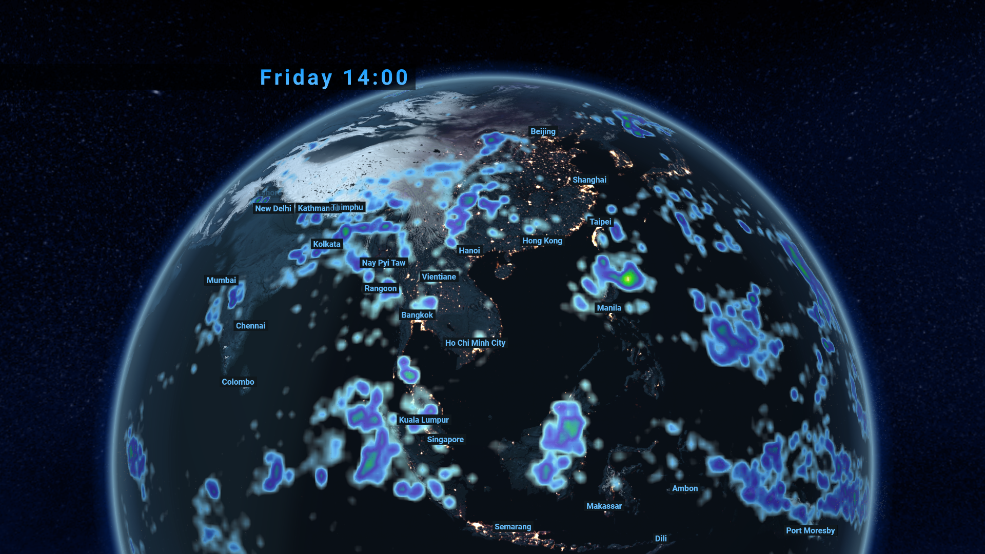
Using a touchscreen to look at a weather globe, for example, the presenter and pick the data to show, time range for analysis, and the speed at which the graphic runs through that time range. This flexibility allows for very dynamic presentation, helping the viewer understand the bigger picture and underlying phenomena, as well as the direct impact of a weather event.
Who watches: those who may be affected by large weather events such as hurricanes, climate and weather watchers, anyone interested in weather as news

No. 5: The Weather Panorama
Whereas other types of weather graphics are built to provide information in a clear, compelling way, the weather panorama is designed to the viewers a more abstracted experience. Using high-resolution 3D visualization, these graphics give more vivid sense of what it looks and feels like to be in a particular city or region in specific environmental conditions. An exciting way to raise the bar and transport viewers into the scene, these graphics are ideal for high-profiles special events held outdoors, such as cycling tours, ski competitions, football games, and so on.

Rather than show data, these graphics use realistic representations of the terrain and weather conditions so viewers can envision themselves there. Along with a photorealistic depiction of the area, be it a city or the terrain of a more remote area, these graphics may include elements such as clouds, lightning, snow, fog, and even raindrops on a virtual camera lens. Graphics are completely data-driven, but viewers experience that information through a visual manifestation of it. While not generally appropriate for daily use, 3D visualization allows the presenter to show viewers what it’s going to look and feel like in a place they recognize, thereby generating a stronger emotional attachment to the forecast.
Who watches: people interested in following an event, event goers, climate and weather watchers

Optimizing for Your Viewers and Market
Because Chyron Weather is data-agnostic, meteorologists and weather presenters using the platform can create visuals using any combination of data sources. With just the right mix, they can achieve the best results for the niche they need to consider. For people within the broadcast market, weather segments leveraging these graphics become a “go to” for viewers, whether for planning a shopping run, making travel arrangements, or managing a crop harvest.
To learn more about Chyron Weather and how it facilitates creation and playout of top-notch weather graphics for your broadcasts, get in touch with our product experts!


