Bringing the Full Power of Data to News Graphics
Working in news production, you’re likely to encounter various types of data that you want to use to help present and enrich the stories you want to tell. The challenge is to find the best way to get that data or information into your graphics to tell the story in the best possible way.
Harnessing Data at Different Production Levels
Depending on the approach you take and the tools you use, you can use data to bring power at the design level, newsroom level, or automation level, with each option respectively moving from more manual to more automatic. Let’s take a closer look at how and when each approach might be the best fit for your needs.
Power at the Design Level: Chyron PRIME
When working with data that exhibits a high degree of variability, having power at the design level is crucial. The constantly changing nature of data often requires continuous customizability. The ability to adapt rapidly to the evolving news and data is essential for presenting the information effectively. Therefore, you need a highly bespoke and dynamic data source that allows for rapid adaptation, while maintaining control and a high level of customization.
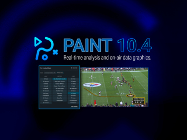
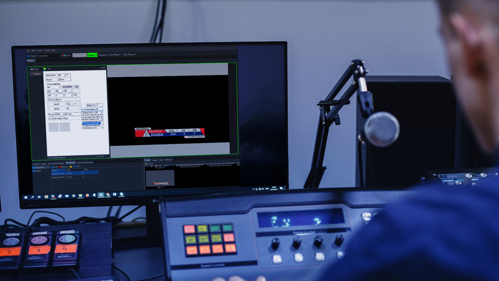
For designers working with graphics in Chyron PRIME, there are different levels of complexity in managing data. At a basic level, logic and conditions can be applied, using a straightforward drag-and-drop function to drop a data object with a preconfigured data connection into the element of the target scene. In a more advanced scenario, a designer can use JavaScript to create parameters for data and build scripts into scenes so that specific chunks of data can be pulled into graphics to tell different stories. (See our blog post, “Leverage JSON Data for Live Sports Graphics with PRIME,” to learn how this model helps broadcasters manage the firehose of real-time sports data delivered by stats providers.)
Power at the Newsroom Level: CAMIO Graphics Management
Bringing the power of data at the newsroom level with CAMIO graphics management is ideal when the design is set, but there is variability in the data you want to show within it. The key lies in managing replaceable fields and elements that are presented routinely, but with a certain degree of variability to them. With this level of control, it’s easier to present information and stories just the way you want and through manual updates, you can tailor graphics to include the right detail.
Working with CAMIO, journalists can pick the graphics they want. As with any other graphics included in the rundown, these are pre-built at the design level to include specific data integrations within certain fields. CAMIO gives journalists the power and flexibility to turn a data integration on or off, or to replace it with something else. And for graphics featuring a photo that changes all the time, the photo and its XML metadata can help with the work of telling the story, automatically populating CAMIO with related details. The journalist can run with that information or go in and manually configure the graphic to include an alternative data point.
Power at the Automation Level: NewsTicker Data Management
Automating processes works best when the design remains constant, and the data received is consistent. In such cases, the data can be leveraged to perform the necessary tasks, without any need for manual intervention. Instead of constantly modifying the data, you can lock the design, how it’s presented, and the content based on the received data.
NewsTicker is a powerful automation tool that provides an easy and efficient solution for managing data at the newsroom level. It can be integrated with any on-air software, allowing the news team to handpick and display relevant information on the screen. NewsTicker connects to various data sources, which means that it can display specific information such as lottery scores, school closures, and weather updates by county.
The only decision to be made by the team is which pieces of information to include. Once that’s decided, NewsTicker presents the information consistently throughout day-to-day operations.
NewsTicker has the power to automate the presentation of election data. This means that standard elements such as headshots of the candidates and their party affiliations can be presented in a clear and concise way, without requiring manual intervention. This automation ensures accuracy and efficiency in the presentation of important information.
The Power of Three: A Mix-and-Match Model
Depending on the scale of your news production, you’ll likely employ a mix of these three approaches to managing and presenting data. Generally, the decision depends on the form that data takes and how much you need to customize it, or not, to take it to air.
Major sports and network news programming often use a similar model to keep viewers informed and engaged. At the bottom of the screen, a constant scroll of the latest news or headlines is displayed. The name of the current story, complete with the right look, logo, and branding is also added. While this feature remains consistent, it may be removed if it becomes distracting or obstructive. Additionally, information pop-ups to the side of an anchor, commentator, or reporter can provide more detail about the story. For instance, a profile of a local politician with a headshot and basic facts may be displayed. During elections, live data may be incorporated into the graphic to keep viewers updated.
Although some data handling approaches are not novel, tools like PRIME provide innovative capabilities in this domain. The major difference lies in the ability to leverage all three approaches, thereby empowering the design process, newsroom, and automation. This results in better flexibility and efficiency in utilizing data and graphics for creating compelling news stories.